Gallery Grid Configuration
The gallery page is laid out in a grid. This panel configured how that grid is set up.
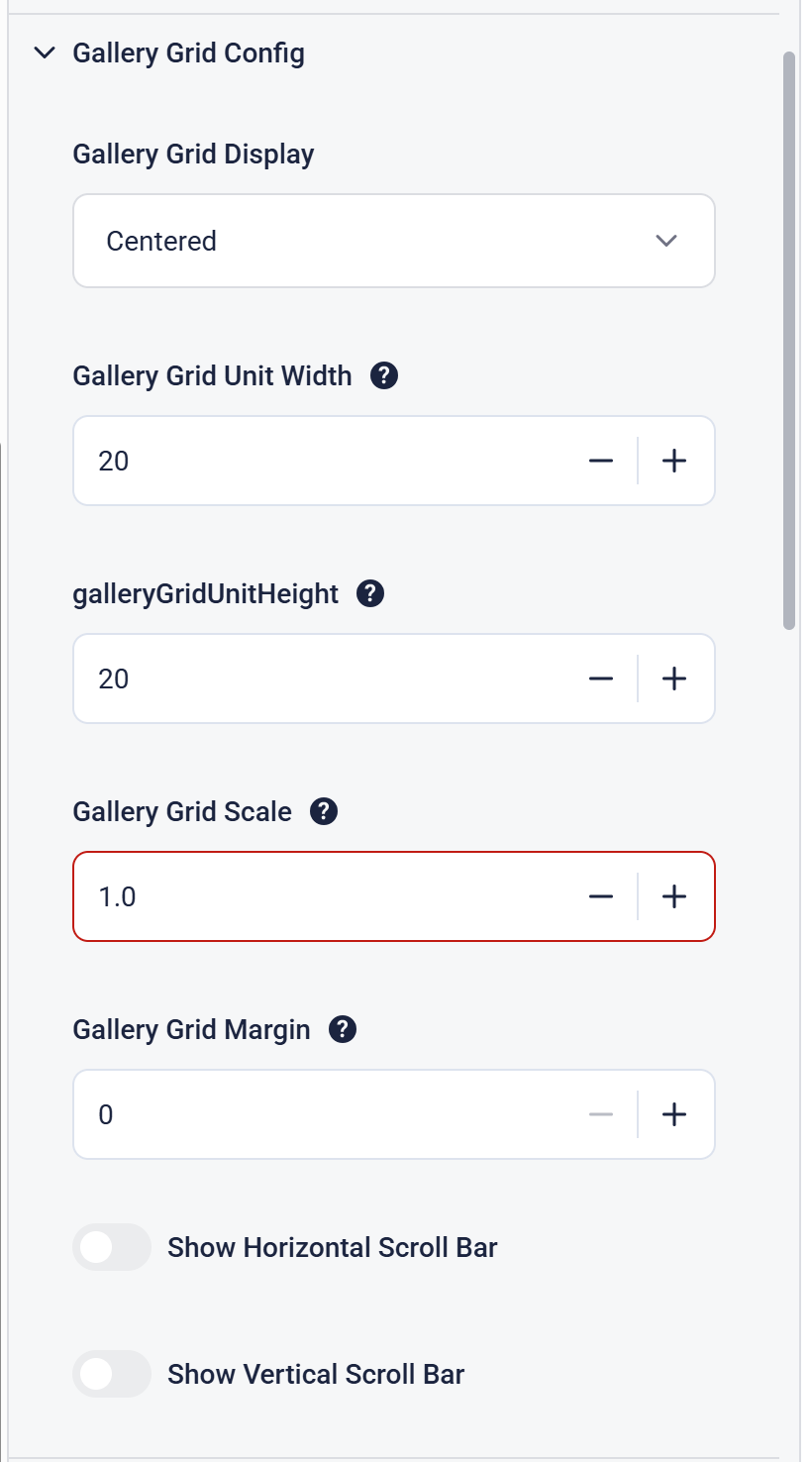
There are two ways of displaying the grid layout - Centered and Top Left. Centered is default.
In a Centered grid, the items are arranged as per the grid that is displayed but the items are centered on the page in that grid. This is the default.
In a Top Left grid, the items are arranged from the top left corner of the screen. This is usually used when trying to replicate a physical layout (Learning Base) or aligning preview items to a background image (Weird and Wonderful).
The grid itself is based on 100 vertical slices (i.e. percentages). The height of each grid cell is not limited.
This means that the Gallery Grid Unit Width should be set to the total screen pixel dimensions divided by 100. For a 1920x1080 screen you should set the unit width to 19 (1920/100).
Typically the Gallery Grid Unit Height is set to the same value for a square grid. This is not essential, but good practice.
Gallery Grid Scale can be use to make the entire grid larger or smaller so that you don't have to resize all items.
Gallery Grid Margin is the amount of space between each item. This is 0 by default so you can put items next to each other.
Show Horizontal Scroll Bar and Show Vertical Scroll Bar are used to show a scroll bar for Interactives that span several screens.